

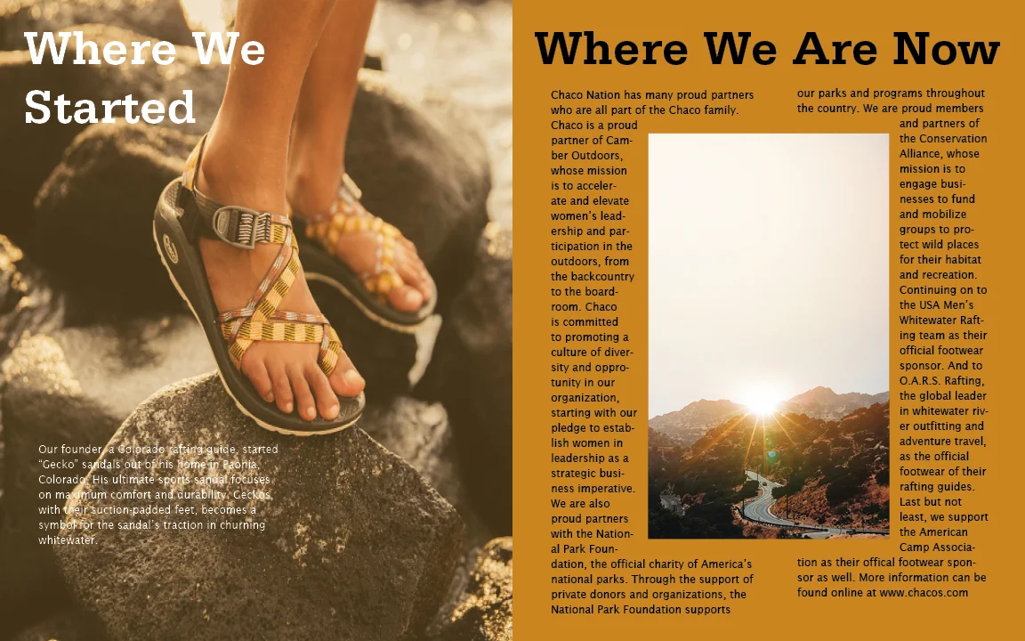


This is a brochure I made in my Typography II class. We were assigned to make a brochure for any company or brand we like, and I decided to go with Chaco Footwear! I first picked the “out west” theme and color palette and then moved on to pick the two typefaces I think best fit the rugged vibe I was going for. I wanted the color palette to get a shade darker with each flip of a page while also switching the layout of each spread without it feeling disconnected from the rest of the brochure.
This was the second part of the project, we had to make a website page that paired with our brochure. This was a lot of fun to put together, especially trying to think of the viewers experience they’d have while scrolling down the page.